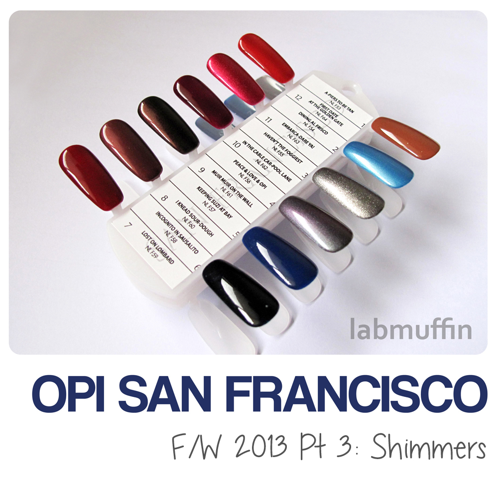
Now for the final part in my San Francisco swatch series – the much-anticipated shimmers! (If you missed it, here are the San Francisco cremes and liquid sands.)
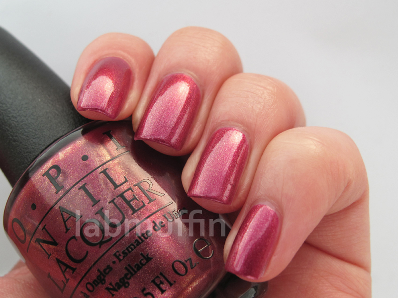
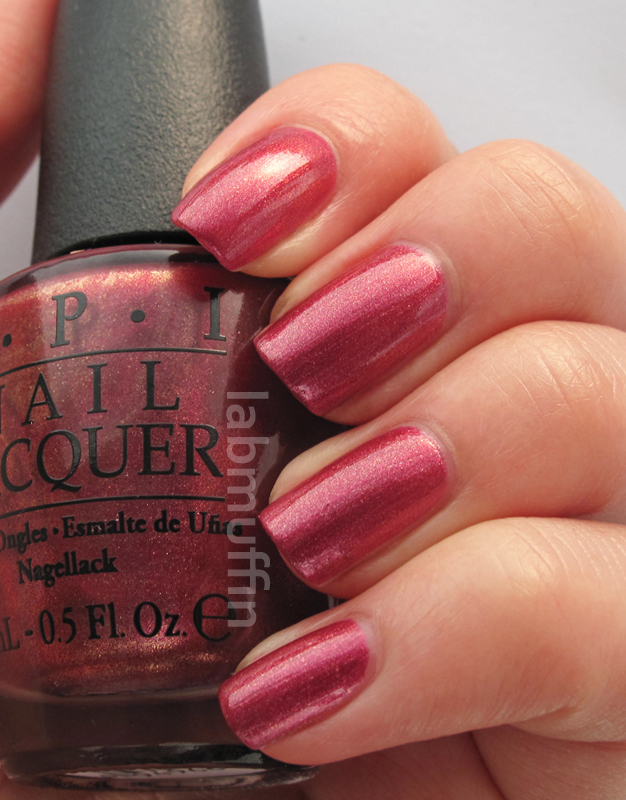
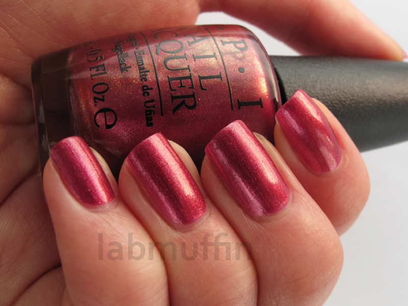
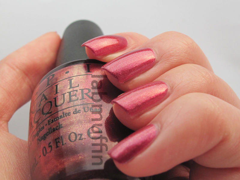
Muir Muir on the Wall is my favourite shimmer from this collection – it’s a maroon to green-bronze duochrome. The duochrome isn’t as breathtaking as, say, Ozotics, Nubars or even Peace & Love & OPI, it just gives a mild edge that makes the elegant deep plum a bit unusual. It’s the sort of colour a non-nail addict might see and love, but won’t be able to put their finger on why.

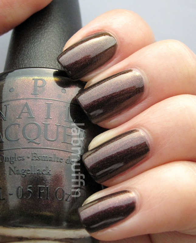

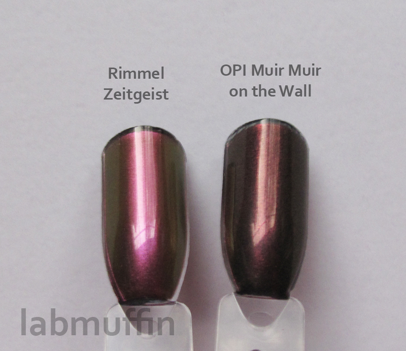
Muir Muir on the Wall is most similar to Rimmel Zeitgeist in my collection, though the duochrome isn’t as obvious and the purple is much richer.
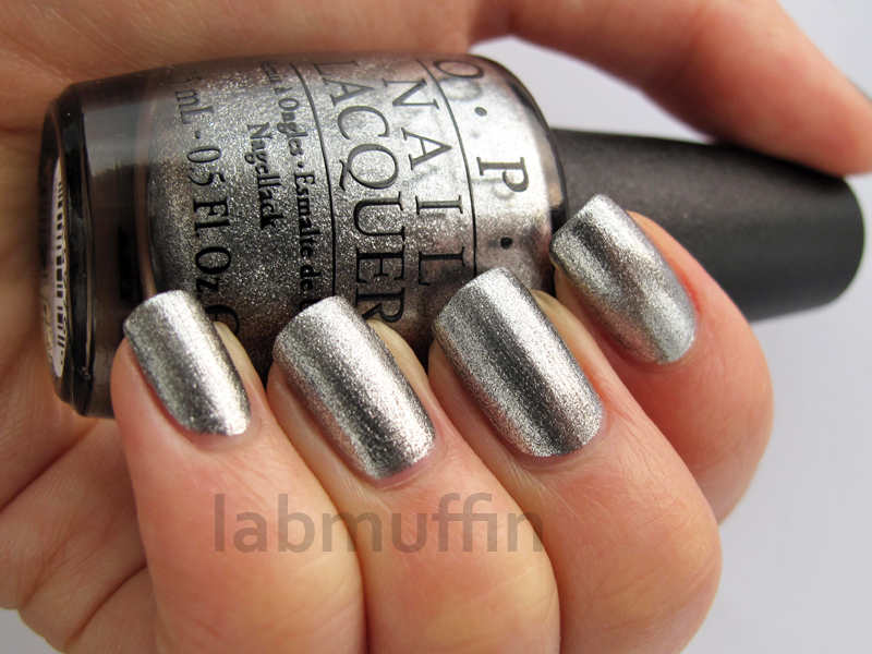
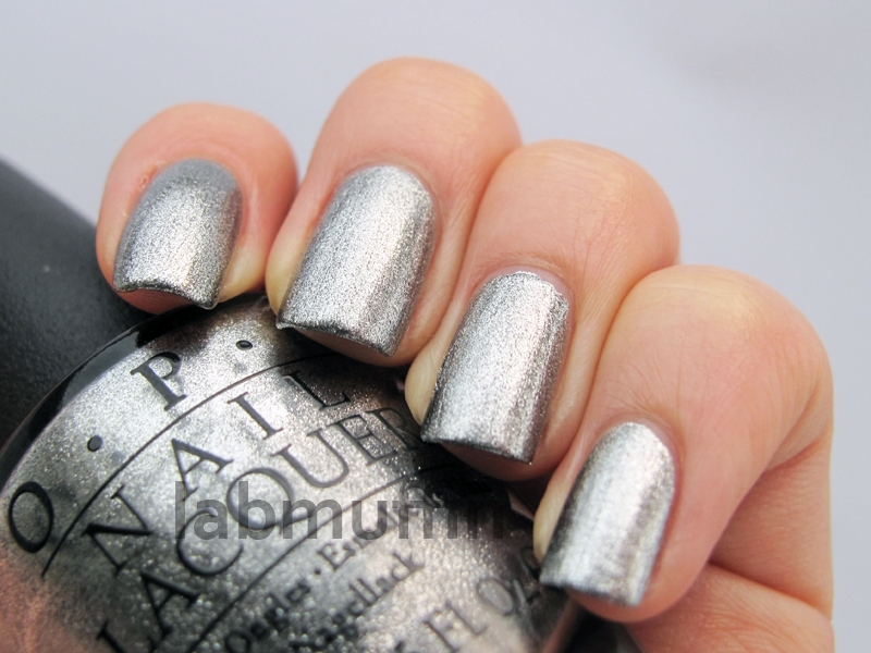
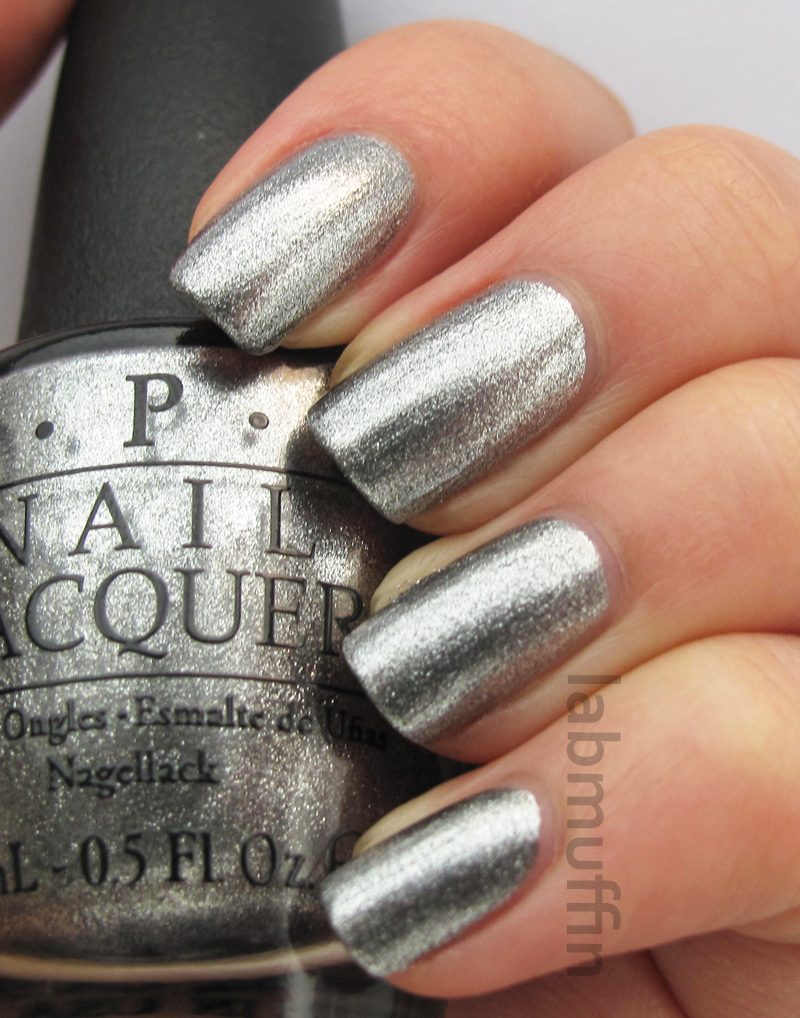
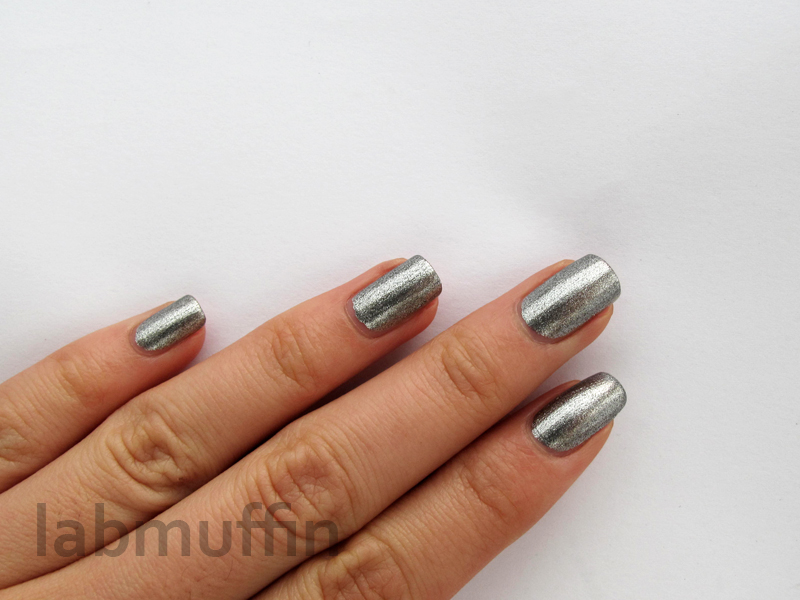
Haven’t the Foggiest is a gorgeous dense silver shimmery foil. I’m not a fan of wearing these blingy shades by themselves, but I’ll be using this for nail art and the occasional feature nail.
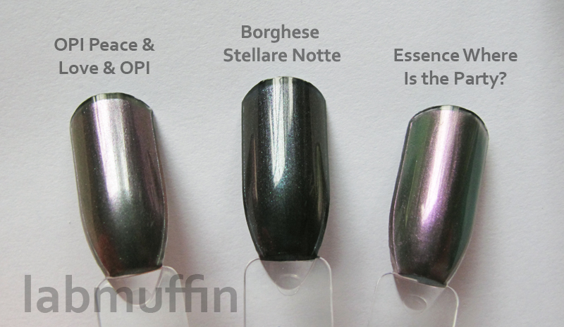
Peace & Love & OPI is a teal-purple multichrome that borders on bronze at extreme angles.

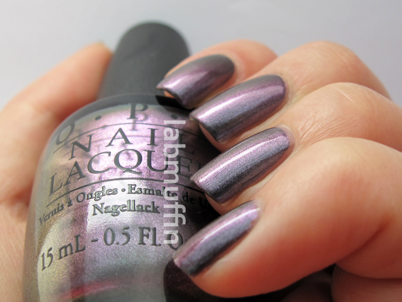
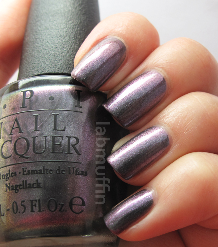
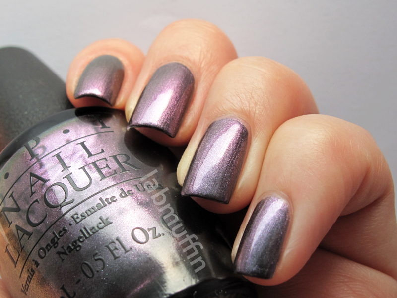
It’s a bit like a lighter version of Borghese Stellare Notte. Essence Where Is the Party? is similar, but the colours are reversed. While the colour shift isn’t as dramatic as the Ozotic multichromes, for example, the purple shows up even at very shallow angles, which makes the duochrome effect quite stunning, since your two eyes often see two different colours at once!
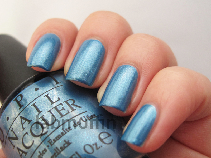
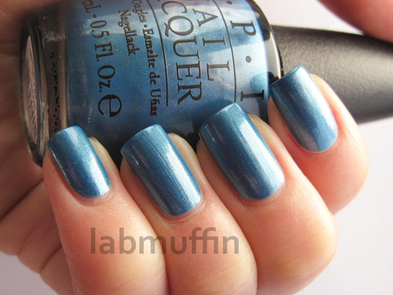
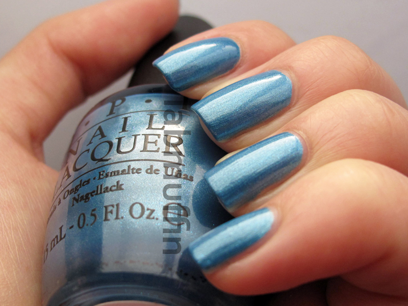
Dining Al Frisco is a light blue shimmer with a smidgen of bright cyan shimmer mixed in. The bright shimmer makes this polish quite unusual!
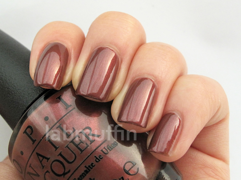
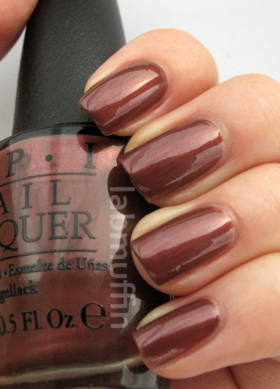
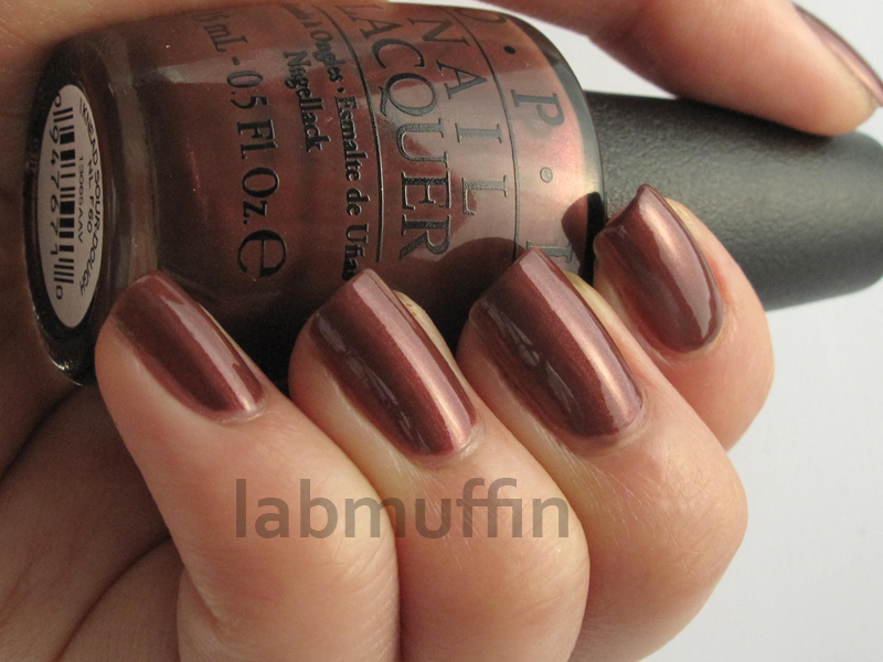
I Knead Sourdough is a beautiful muted brown-tinged red that I love in the bottle, but not on my nails 🙁 I hate when polishes do that! It has the same foggy quality as Chanel Paradoxal, but with red shimmer instead of purple, which makes the contrast less obvious.
Embarca-Dare Ya! is cool pinkish red with gold-toned shimmer. This is one I liked more on my nails than in the bottle.
All of these applied beautifully in 2-3 coats, and dried smoothly without top coat. My picks from the shimmers would have to be Muir Muir on the Wall, Peace & Love & OPI and Embarca-Dare Ya!
This collection will be officially launched in early August, both in Australia and overseas. I love when the Aussie release date is the same as overseas – in today’s global marketplace, I wish more companies would embrace this!
This product was provided for editorial consideration, which did not affect my opinion. For more information, see Disclosure Policy.


Now were talking! These are stunning!! I love that silver foil one a lot! 😀 Great swatches xo
Haha! I have to admit that shimmers in general don’t excite me like they used to, but the duochromes and Haven’t the Foggiest are pretty interesting!
These are pretty! I’ll probably pick up Muir Muir on the Wall, Peace & Love & OPI, and Embarca-Dare Ya! Although none of those names make absolutely any sense to me…
I had to Google them too. Nice picks!
Haha, I’m from San Francisco and I was wondering how many people would get the names! I think Muir Muir on the Wall fits the look and atmosphere of Muir woods wonderfully, but I wish they hadn’t used “Frisco” in the collection. Emperor Norton would have fined them (and I wish there had been a polish named after Emperor Norton. It would have been awesome…)
Hahaha just read about Emperor Norton – thanks for my Wednesday morning LOLs!
My wallet is already crying in anticipation for this collection…
I know how you feel!
omg!! michelle firstly ur swatches are to die and secondly… i want them all! xx
Thanks Catrine! 🙂 xx
Gorgeouss colours! Swatches are fab! I love opi!
http://www.hbbeautyblog.blogspot.com
Hannah xoxo
Thanks! 🙂
what a great collection!
I wasn’t sure when I read the original press release, but I’m convinced now!
i haven’t the foggiest is so pretty!
It’s really lovely!
I Haven’t the Foggiest reminds me of OPI Designer, de Better! from the Muppets collection! The only difference is that Designer de Better has copper particles in it, which I’m not a big fan of.